In our last post, we had explained how we could integrate SRS reports in Web Parts and make a user friendly Dashboard easily.
The Dashboard work just great… but on the presentation front, SRS report is not that flexible and it takes up a lot of space with the additional toolbars that the Reportviewer bring along. Yes there are few options that can be passed along in the querystring to hide these additional toolbars but then it doesn’t seem to work across all versions.
You must have come across a number of third party chart tools that help you create fancy looking charts. We decided to use the freely available .NET Chart controls available from Microsoft. Today we explain how we could use these controls to make easy to use and fancy looking charts that can be integrated in the webparts to enhance our Dashboard.
.NET charts enable you to design various types of charts
- Area
- FastLine
- Pyramid
- SplineArea
- Bar
- FastPoint
- Radar
- SplineRange
|
- BoxPlot
- Funnel
- Polar
- StackedArea
- Bubble
- Kagi
- Range
- StackedArea100
|
CandleStick
Line
RangeBar
StackedBar
Column
Pie
RangeColumn
StackedBar100 |
- Doughnut
- Point
- Renko
- StepLine
- ThreeLineBreak
- PointAndFigure
- Spline
- Stock
|
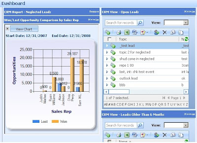
Lets pickup a simple column chart example that shows Won/Lost Opportunity comparison by Sales Rep.
1. The first step is to design the SQL query to retrieve the required information. We would need to design the query to return the result in the following table format
Sales Rep Won Opp $ Lost Opp $
2. So we have 2 series that need to plotted the Won Opp series and the Lost Opp series. The two series would be assigned to the Y-Axis. The Sales Rep being on the X-axis.
3. Once you have the query ready and you have decided on the X and Y axis series, you just have to go ahead and set these as the chart properties.
// Set chart data source
chart1.DataSource = myCommand;
//Set the Chart Type
chart1.Series["Series 1"]. ChartType = SeriesChartType.Column;
chart1.Series["Series 2"]. ChartType = SeriesChartType. Column;
// Set series members names for the X and Y values
chart1.Series["Series 1"].XValueMember = "Sales Rep";
chart1.Series["Series 1"].YValueMembers = "Won Opp $";
chart1.Series["Series 2"].YValueMembers = "Lost Opp $";
// Data bind to the selected data source
chart1.DataBind();
The ValueMember above needs to refer to a column of the SQL query designed.
Note: If you wanted this to be a Bar chart instead… no fuss just change the chart type of series to bar chart
chart1.Series["Series 1"]. ChartType = SeriesChartType.Bar;
chart1.Series["Series 2"]. ChartType = SeriesChartType.Bar;
4. Placing a chart control on a web form and binding it with the data as explained above, you should have a web page ready that displays a fancy looking chart ready.
5. Next step would be to add the URL to this page in your Web part Dashboard and voila you have integrated this with Web Parts as well and now you can benefit from the features of both the tools.
 Hope you get going!!!


